An evolution, not a reinvention. Deep, confident blue paired with bright teal — a look that feels corporate and established, the company we are now. Below: our logo, colour, type and everything you need to use the brand correctly.
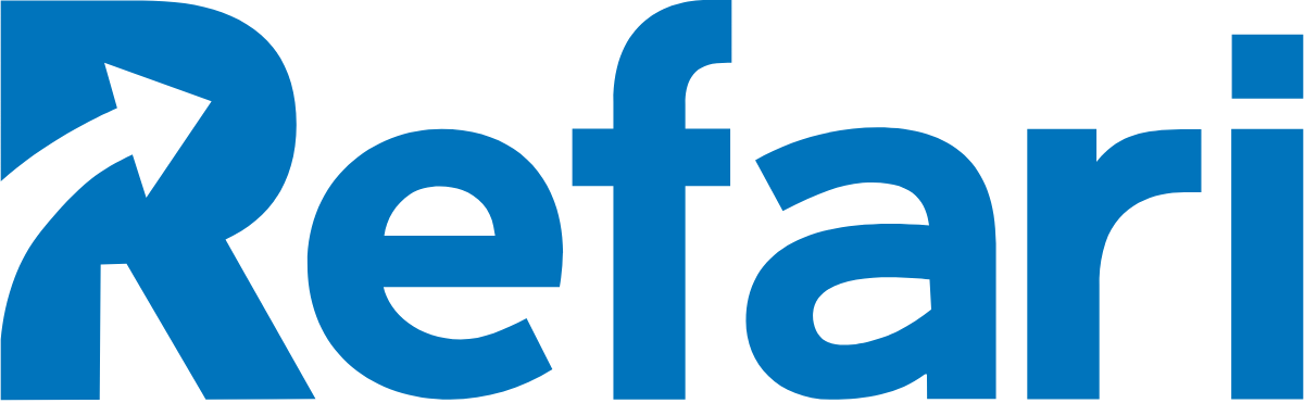
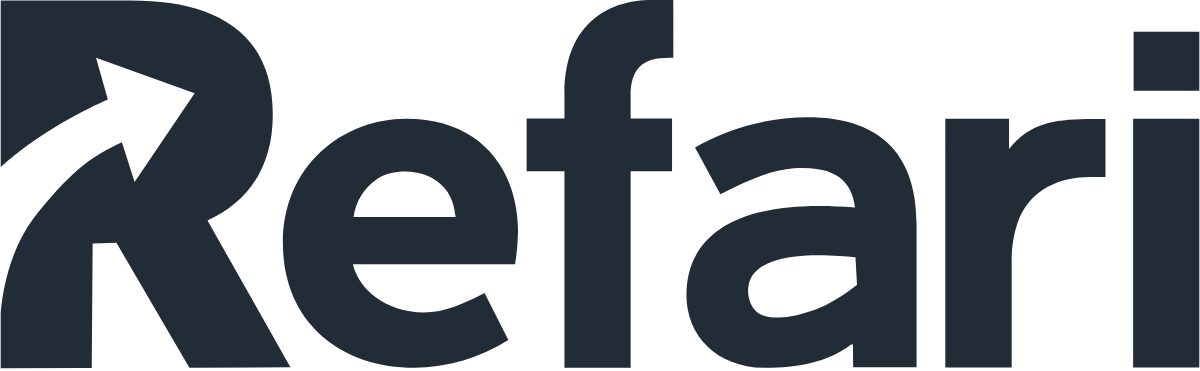
Our logo is primarily typographic. The “Uplift Arrow” inside the R signifies the impact Refari has on the businesses we work with. Give it room to breathe and never recolour, stretch or rebuild it.


Deep blue and bright teal lead. Ink and the supporting neutrals carry everything else. Click any swatch to copy its HEX.
Lato sets our headlines; Source Sans Pro carries body copy. Both are free from Google Fonts, so they work everywhere from slides to the web.
Headings
Lato
Black 900 & Bold 700
Aa Bb Cc
Refari
Body
Source Sans Pro
Regular 400 & Semibold 600
A practical, friendly sans for everything from long-form copy to interface text — clear at any size.
Prefer the vector SVGs wherever you can — they stay sharp at any size. Need everything at once? Grab the full pack.
The SVGs above cover most needs and stay sharp at any size. To edit the artwork or for print, start with the Adobe Illustrator source.

